
Lonestar Film Festival
Problem
The Lone Star Film Festival faced a dual business challenge. Firstly, it required a significant boost in audience awareness and engagement to overcome a post-COVID-19 dip in attendance. Secondly, the festival's existing brand strategy was unsustainable and costly, as it demanded a full, resource-intensive rebrand every year, often relying on donated work or large investments.
Solution
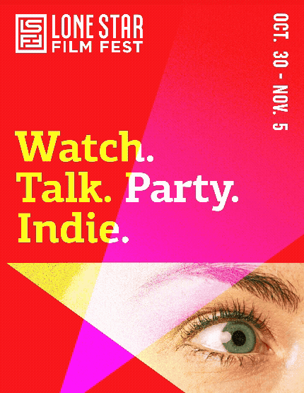
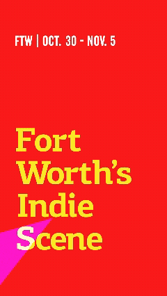
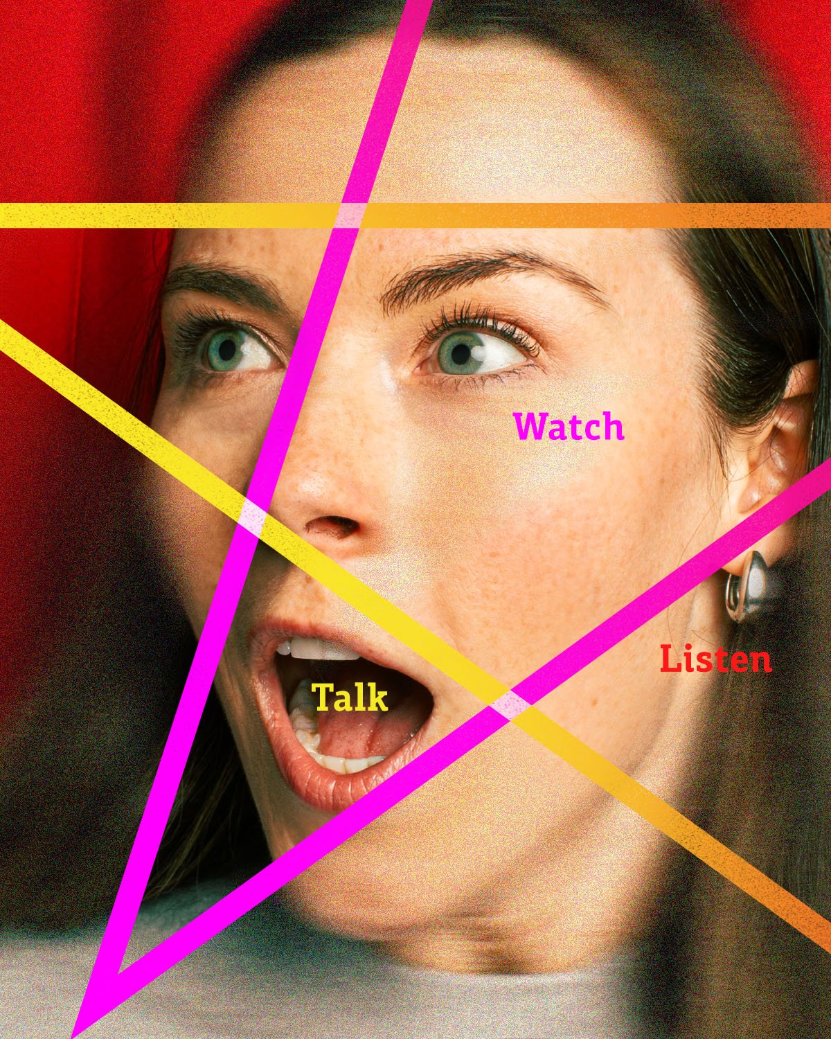
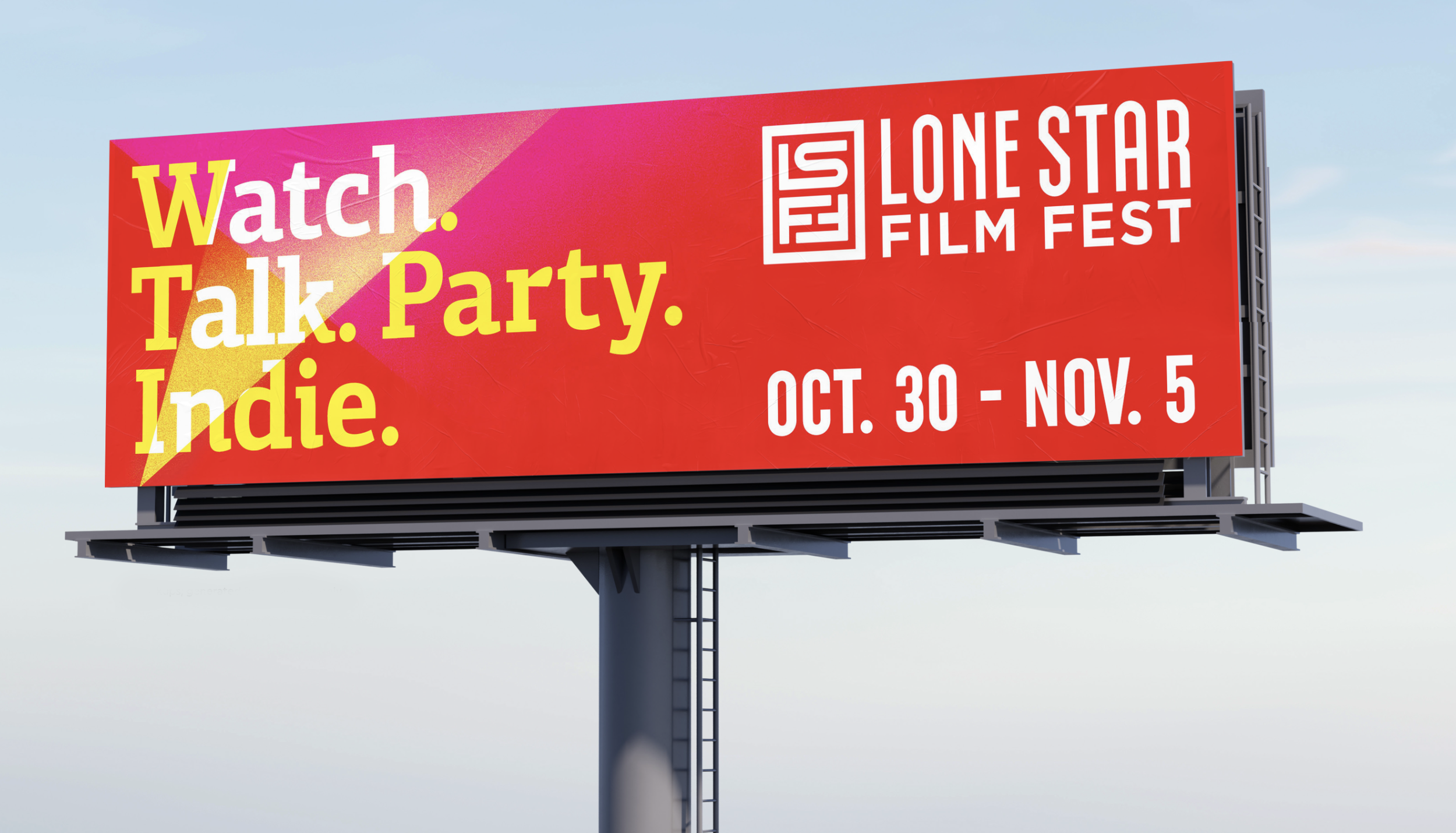
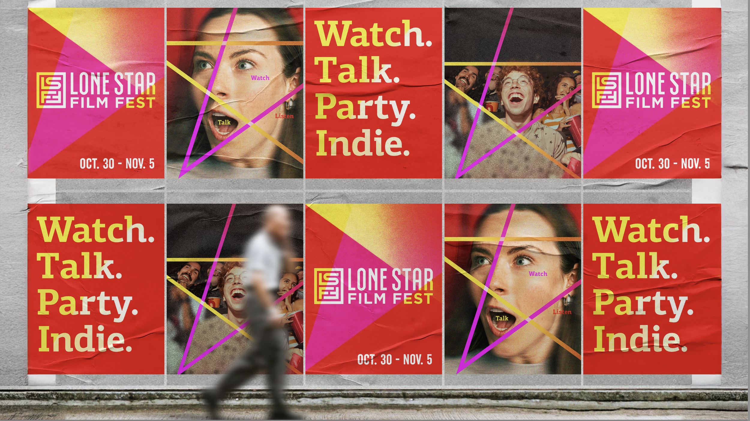
The solution was the creation of an innovative and highly adaptable visual identity. Designed for enduring recognition, this new brand system can be deployed consistently across every event and platform, solving the problem of costly annual rebrands and allowing the LSFF to build lasting equity. The core visual anchor is the Lone Star, which leverages dynamic, overlapping beams of light reminiscent of Hollywood searchlights. This strong, consistent motif, paired with short, punchy copy and a vibrant palette of reds, pinks, and yellows, successfully raises awareness and captures the excitement of attending the festival.


Credits: Taylor Potts (Creative Director), Holly Aguilar (Design Director), Wallace Cruz (Multimedia Art Director),Stephanie Orges (Copy Writer)
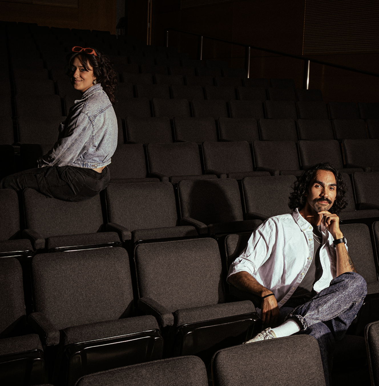
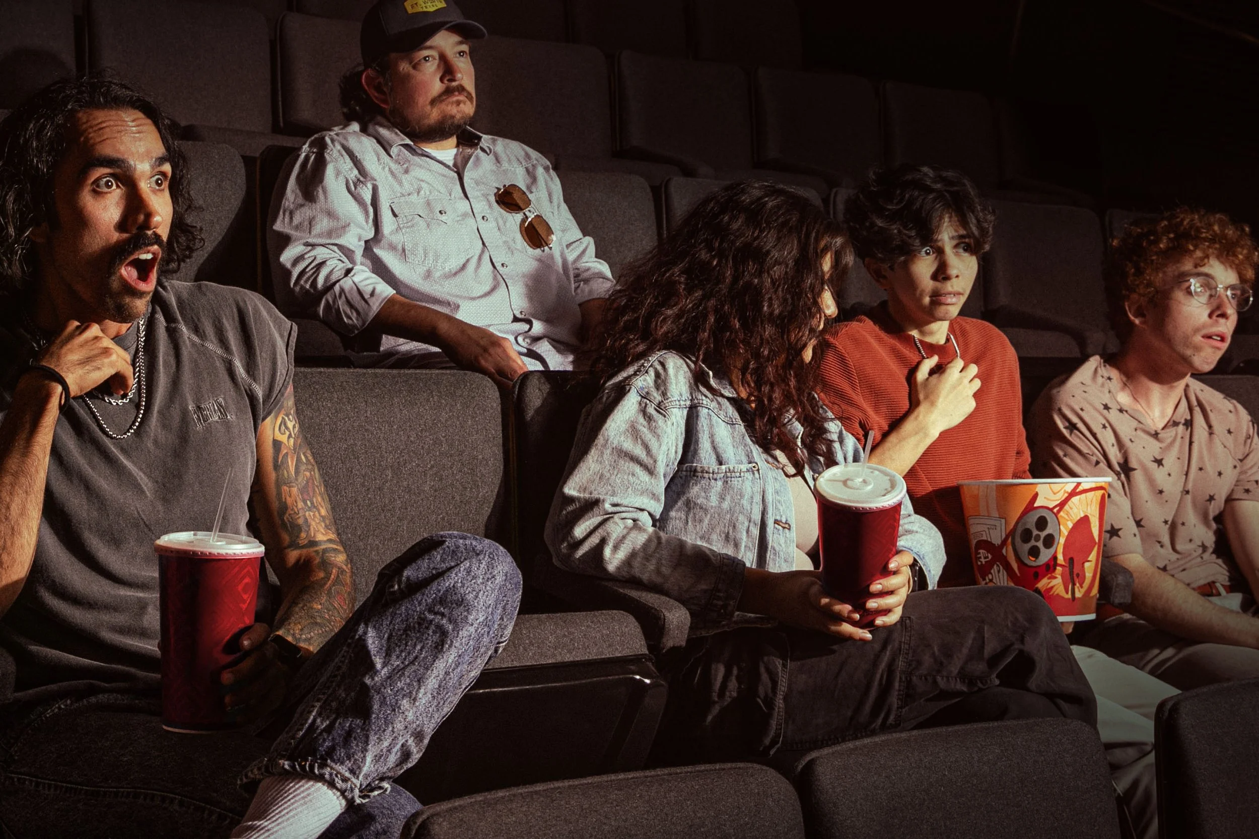
Feb 2026: Silver Addy • Brand Identity Guidelines Feb 2026: Silver Addy • Art Direction Campaign Feb 2026: Silver Addy • Art Direction SingleMy Role on this project: Served as the art director, collaborating with the team to evolve the festival’s initial concept into a fully realized creative direction and comprehensive brand book. I created moodboards, defined the photography style, and executed all photography—from shooting to final edits.